Poster
Future visions and reality shocks
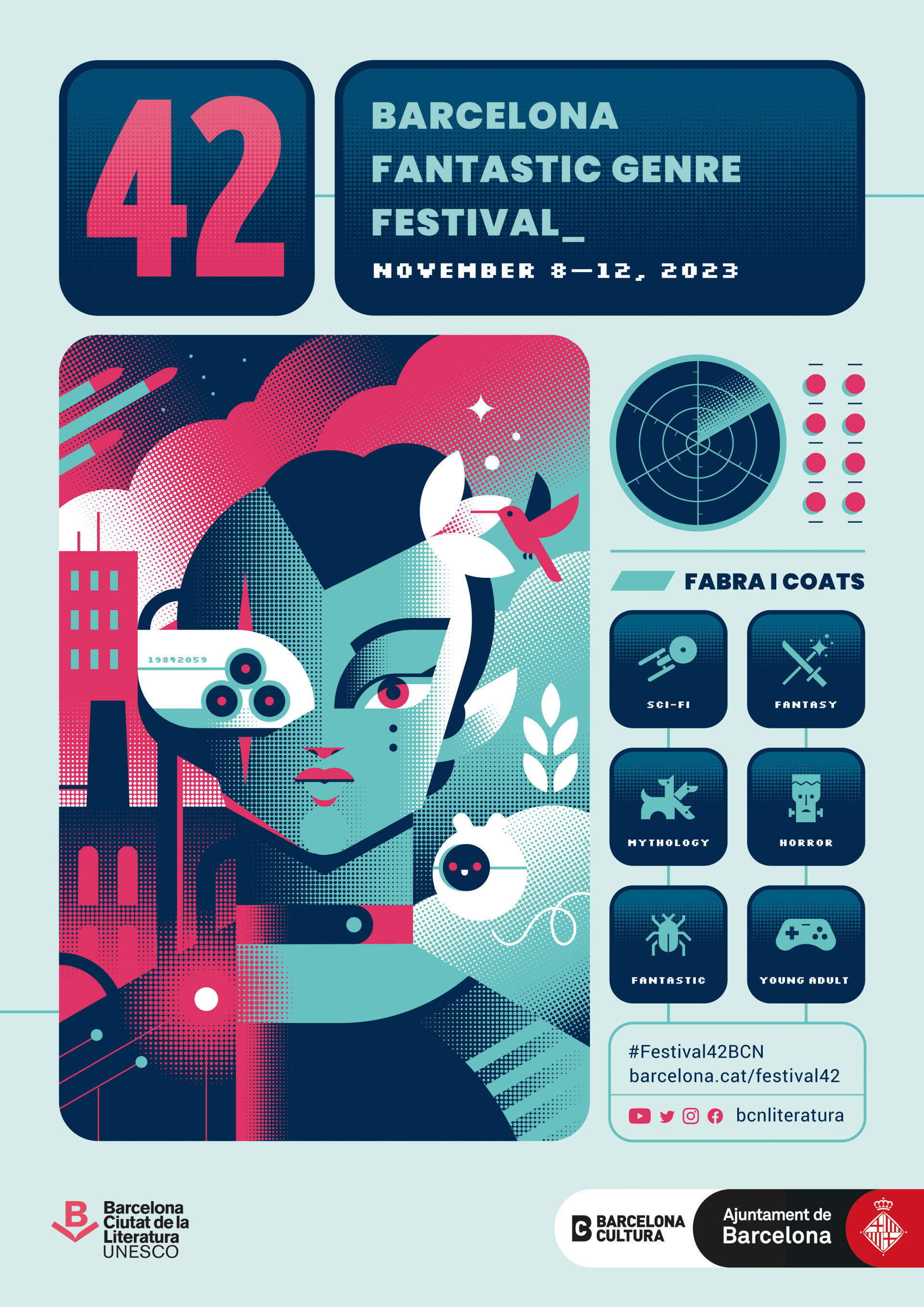
The renowned illustrator Maria Picassó blurs the lines between utopia and dystopia with her poster announcing the third edition of Festival 42.
The dystopian and utopian worlds featured in the fantasy creations in recent decades feed off the retro-futurism of the 1950s, ‘60s and ‘70s, an optimistic trend that was fascinated by the future and its accompanying technological advances. This movement has its counterpart in the wave of dystopian worlds that have emerged in recent years. As a result of this paradox, Maria Picassó, the author of this year‘s Festival 42 poster, has turned to these escapist genres as the best way of placing a mirror in front of our society.
An architect by training and an artist by vocation, Picassó (Manresa, 1983), has had quite a heterogeneous career and own clearly identifiable brand, thanks to her vectorial, geometric style, which renders reality down to its essence. Her use of shapes and riotous colour results in a striking, atemporal perspective that connects perfectly with the spirit of non-mimetic genres. Naturally, the author habitually works with science-fiction publishers, and she has illustrated works by Ursula K. Le Guin, the classic Dune by Frank Herbert —the cover of which has been selected as part of the Communication Arts Illustration annual— and some novels by the hopepunk author Becky Chambers.
True to her own heterogeneity, Picassó has also explored the world of video games, where she has worked for international horror, fantasy and science-fiction franchises, including The Walking Dead and Star Trek, where she was responsible for the design of the game‘s interface icons. It is, therefore, no surprise that the poster for this year‘s edition of the festival emulates the control panel of a spaceship, a machine or a computer. The author admits that she was looking for an immersive effect, reproducing a video game interface: what would happen if someone pressed the buttons?
Therefore, the image of this year‘s Festival 42 aims to be the frontier between our reality and a fantastic universe. Is it in the future? A distant past? A parallel dimension? Another planet? It‘s all in the imagination of the spectator or visitor. Using colour, shapes and a series of points, the illustrator turns to the retro-futuristic style that she finds so interesting. The poster‘s various controls also provide information about the festival: the variety of non-mimetic genres are represented with pictograms, and the main screen offers a divided imaginary universe. We see a person on the frontier between utopia and dystopia, a duality that is reproduced in that person and which can be interpreted as two halves, two possibilities... or a whole. The aim is for the spectator to let their imagination flow and interpret this as they will because this year‘s festival will be reflecting on possible futures and new realities. Furthermore, the dystopian image of the illustration refers to the Fabra i Coats building, which is hosting the festival. This zero-kilometre element enhances its impact as a counterpart to the tranquillity found in the utopian part of the image, dominated by vegetation, in a clear solarpunk reference. A single poster, an infinity of possible worlds. Or, to paraphrase the festival‘s unofficial slogan: There are other worlds, but they are all at the 42. And now, on its poster, too.


